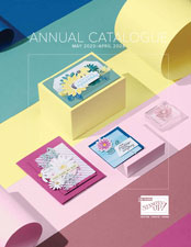
Its an exciting time to be a Stampin’ Up! demonstrator. We have access to our new catalogue and the opportunity to pre-order new crafting supplies. Look how gorgeous the front cover is.
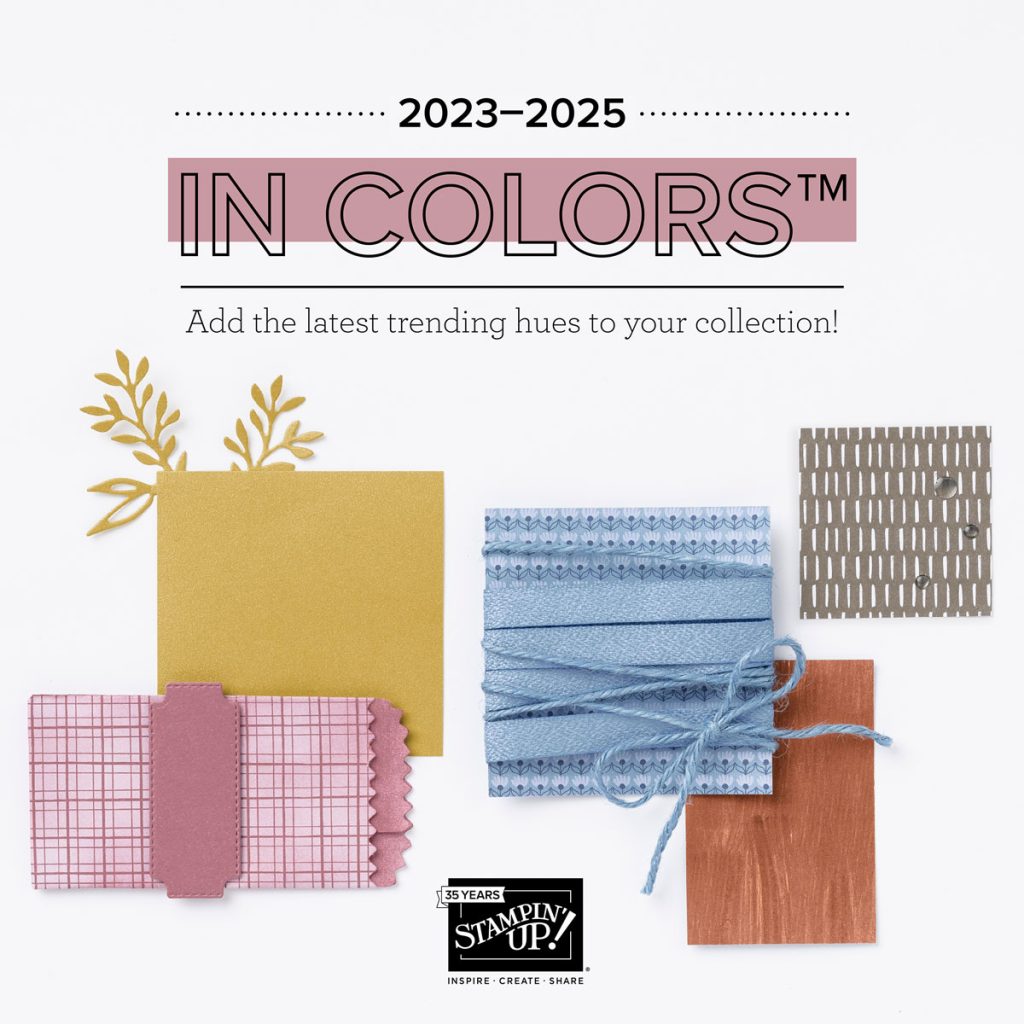
So retiring are the 2021-2023 In Colors. With a twist!
Stampin’ Up! have given us on trend beautiful new colours once again!
Here are a few samples of how I think they could be mixed with existing colours in the palette. Do you have a favourite? Or do you think I am way off with my combinations?
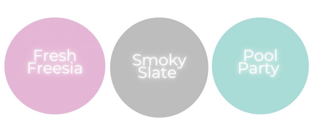
Staying with us is Fresh Freesia, I see a colour that offers a purple slightly paler than Highland Heather, with a slightly pinkier tone.
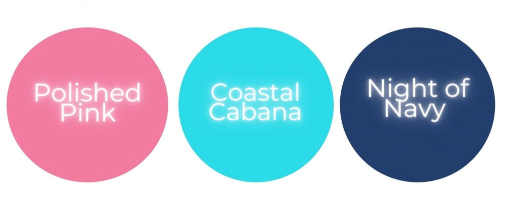
Polished Pink offers a pink that’s not as bright as Magenta Madness or a deep as Melon Mambo.
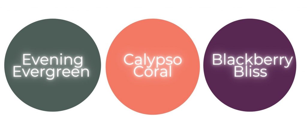
Evening Evergreen I think is going to offer me a green not as brown in shade as Mossy Meadow and richer than Garden Green, perfect for the Christmas season I think.
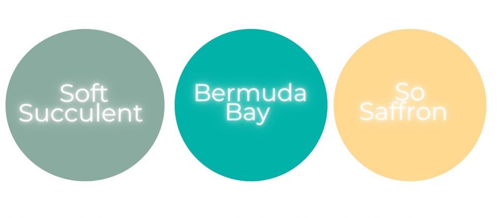
Soft Succulent to me looks softer than Mint Macaron and not as dark as Just Jade, offering a perfect compliment to my selection of greens (who knew I needed more).
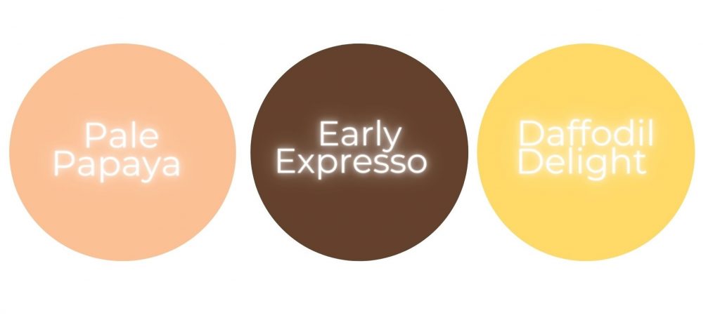
Pale Papaya is the colour I am unsure where to fit. When I see it inked I will know. At first glance it offers an orange tint that will be paler than Calypso Coral. And a deeper peach than Petal Pink… which suggests its a fab combination of pink and orange!
I will be doing a follow up once I have got the inks in my hands. A Facebook Live will demonstrate how the inks fit with reference to this blog!
Love how you paired the new in colors! Saved your combination.
Thank you so much 🙂 I cant wait to actually get my hands on them!